Does Pinpoint Get the Point? Insights on our First User Testing Session
Are you tired of wrestling with disorganised media assets, clicking through many folders and searching for various permutations of the same thing before finally finding what you need? This is why we embarked on the journey to create Pinpoint.
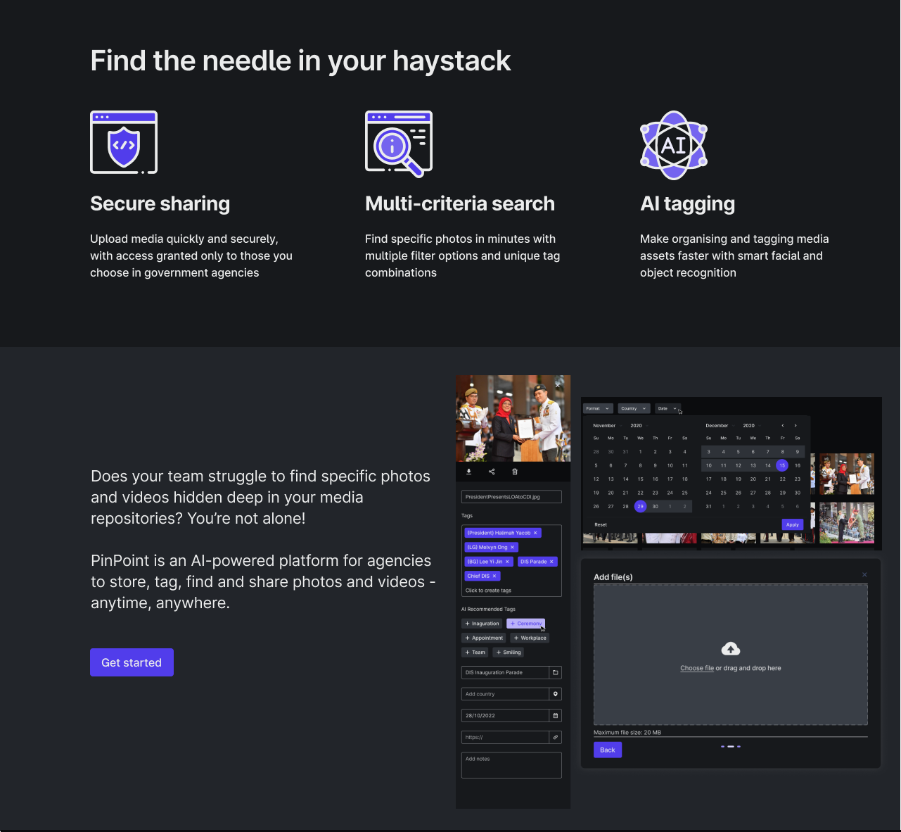
Pinpoint is DOTC’s first collaboration with OGP. The brainchild of a hackathon, it is an AI-driven media gallery solution. It is designed to make life easier for those in the government – from those in media roles to more intelligence driven ones, allowing them to effortlessly manage and find their media assets anytime, anywhere.

A few months back, we conducted user exploration sessions to discover that such pain points exist for media assets, and then subsequently went into development for Pinpoint as a solution. Instead of the traditional, time-consuming method of precisely naming and sorting media into different folders, while dealing with different variations of nomenclature for the same people or assets, Pinpoint works primarily through tags and filters.
Testing out Pinpoint with our Users
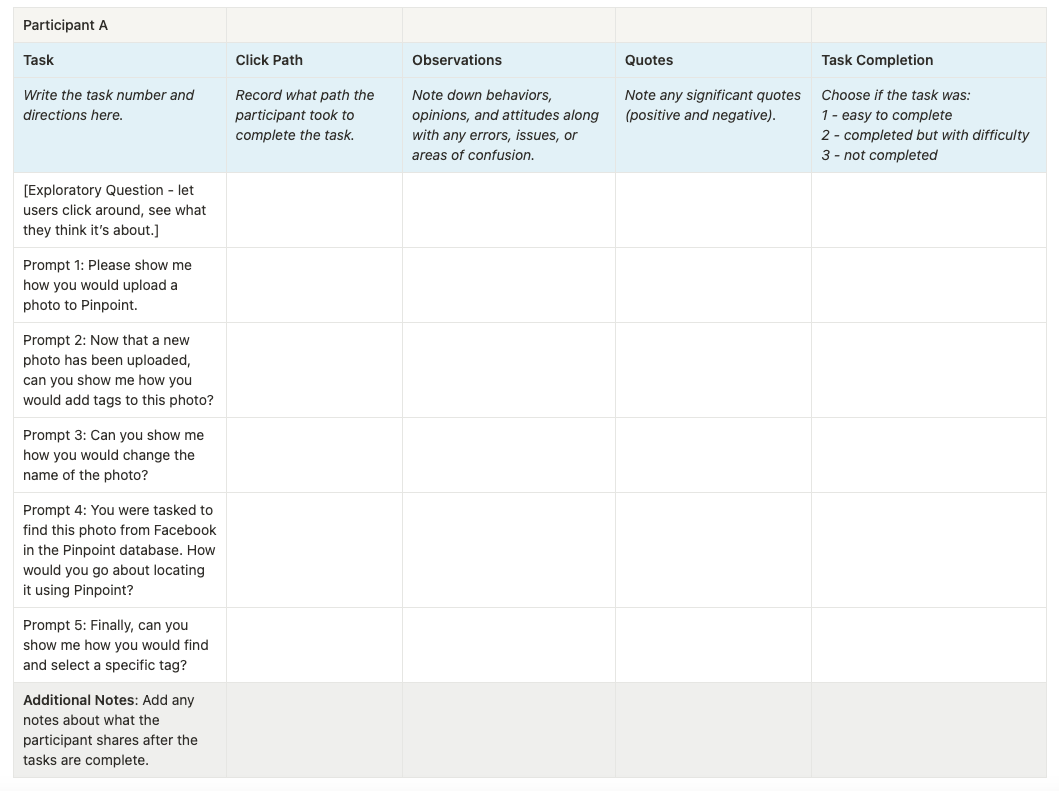
Through our user testing session, we wanted to uncover any usability issues in the process of using Pinpoint to upload, organize, and search for assets. Gathering our users in three separate sessions, they were able to interact hands-on with a working prototype of Pinpoint, and given tasks to perform.

Our users ranged from a diverse group – from those who work commonly with photography for media and event purposes, to those who analyse and synthesise important results from a collection of media. This ensured that we were able to cover a wide spectrum of perspectives, as well as ensure that Pinpoint covered the various use cases that we had identified.
What we Learnt
The feedback we received were really insightful, and we were incredibly happy to learn that users felt this would be a great alternative to their current workflow, and that Pinpoint would indeed improve their processes massively. They praised the intuitive interface and the potential of simplifying media organisation.
At the same time, their constructive criticism highlighted the areas where we could further improve the user experience of Pinpoint, as well as clarified the features we should prioritise next.
Overall, the sessions were great, and being able to see Pinpoint in use by our actual users, even in quite a raw prototype form and their eyes lighting up as they got excited about its possibilities, really boosted the team’s spirits. It reinforced our belief in the power of user-centric design and how the insights we got could be turned into meaningful enhancements.

The Path Ahead
At DOTC, working iteratively and hand-in-hand with our users is incredibly important to us. Seeing how Pinpoint can genuinely make a difference to their work is an amazing feeling. As we look to the future of DOTC, it really helped us to see the boundless possibilities not just for our product, but for the team of wonderful people that we work with here.
Pinpoint isn’t just a software; it’s a game-changer. With the insights derived from our user testing sessions, we are ready to make it even better.
If you are eager to join us in pushing boundaries and building what truly matters, we are actively seeking talented individuals – software engineers, UX/UI designers, and product managers. DOTC is where innovation thrives, and we invite you to be part of our journey. Contact us to find out more.

